hey hot stuff!
woo woo! pretty smokin' huh?
i really wanted something simple, fun, colorful and more me than what i had going on. i spent hours and hours pouring over designer websites comparing designs, costs, ideas and waiting lists. i finally decided that if i wanted to really appreciate and enjoy my blog makeover, i would just have to do it myself.
so i started jotting down things i liked about other people's pages. i made a list of things i thought i might like. i wrote down all of my favorite colors. i researched things like seamless backgrounds, hex color codes, installing web fonts and downloadable digital graphics on etsy. this is quite literally a labor of love. i did every single bit of it by myself and by george i am so proud of it.
so here is a quick tour of what i have got going on here:
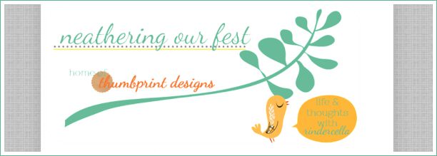
a new header. i plan on writing up a full tutorial on how i did this but for now i will just hit the high points. it was designed with graphic elements from todd design who has all kinds of amazing graphic design elements available in her etsy shop. my next mountain to climb is to determine if i can use paint.net to somehow "slice" the section out that says "home of thumbprint designs" and incorporate a link to my shop in there. that is some serious html wrangling though so i don't know if i will be able to figure it out. trust that if i do figure it out, it will definitely be made into a tutorial!

next we have the navigation bar. this was a lot of fun to figure out because i had to install google web fonts (yep - tutorial coming for that too!) and edit the css (cascading style sheet) in my template designer. i hope you folks think nerdy computer talk is sexy because if you want to learn this you have to seriously get into it! i learned how to use a link list instead of blogger pages so that i can link to pages outside of my blog (like my shop).
i am sooo in love with my new contact buttons! i was really bored with all of the generic social media icons out there so i just played around with making my own! so now you people can stalk... er follow me on pinterest & twitter, email me, subscribe via rss feed or like me on facebook!
i also have a direct link to my etsy shop now so you don't have to find a link somewhere in my post to get to it. you can also get to it by clicking on the "shop" link on my navigation bar up top!
if you are feeling the love i'd love for you to grab & share my button on your blog! :) soon there will also be a shop button as well but it's going to be a little different and reflect the new header for my shop (coming soon!) that will tie the blog and shop together seamlessly ;)
the "new" sponsor section! i have to say that i have been so excited to participate in the sponsor swap! i think it is a great deal for those of us who would like a little extra exposure but don't quite have the money to buy ads on other blogs yet. i am excited to announce that i will have some changes to my sponsor section coming up in september (which you can read all about on my sponsor page) but i will still be offering the sponsor swap ads! i will be posting more about it in late august so keep your eyes peeled!!
follow me with google friend connect... or you can subscribe to my rss up top in the contact section!
the archives and topics. here you can find all the posts i have ever written. wanna read all the top five friday posts? or maybe all of the posts i wrote in april this year? this is where to find it folks! :)


Yay! I LOOOVE it! It is happy, fresh, colorful, modern, PERFECT. I especially love the icons in your sidebar. Well done, friend! I KNOW that was a TON of work! :)
ReplyDeleteI love it! I love all the fun colors and the bird is soooo super cute! =D
ReplyDeleteit looks fantastic. i'm so impressed you did it yourself! wow, great job~!
ReplyDeleteLooking good electronic Sky!!!! :)
ReplyDelete